
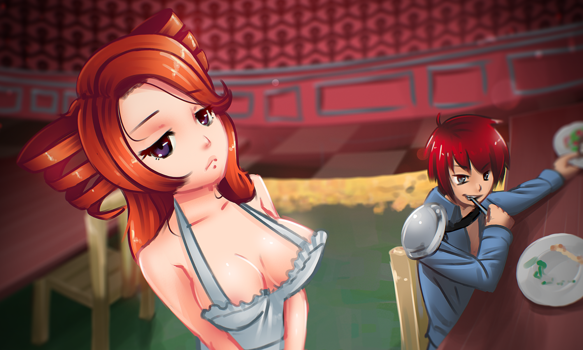
Our website will be getting a makeover soon… just got this from the graphic artist today!
Quality adult games, for free, forever.
Our website will be getting a makeover soon… just got this from the graphic artist today!
You must be logged in to post a comment.
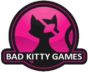
Between the logo you have here and the logo you showed on Patreon I prefere the latter. Either way it looks good.
Usage-dependent, perhaps? For stuff like the Discord/Patreon thumbnails, the solid-colored version seems a better choice, as it’s bolder and stands out. As an ident to play while the game starts up, the shaded version is probably more dynamic. The same could apply to the website, as the shaded version might be good for the landing page, but the one-color version might be better for pages that the logo/color scheme is more of a “frame.”
But that’s getting rather technical and I’m not really a designer, so I’ll just leave it at “I like them both.”